
Bla, Bla, Bla

html / bla, bla, bla ...
Bla, bla, bla, step by step...

Practicing & Describing
Praticando e Descrevendo
Bla, bla / Index
html / bla, bla, bla...

Maximum size per web pages
A minha MUSIC page estava já bastante crescidinha ao ponto de impossibilitar a pesquisa por palavras ou frases e isso tornou-se realmente num problema mas, sem certezas, andava cá eu a matutar qual seria mesmo a razão de tal falha...
Como a página não apresentava qualquer erro no código comecei a apontar para a origem do mal no tamanho (bytes) e finalmente decidi dividir a página em duas... Logo se verificou que estava aí o busílis da questão...
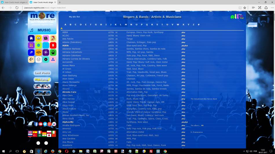
Na página original "MUSIC" mantenho por agora todo o conteúdo de "main" e "aside" e para a nova página "music singers index", com código provisório (*), segue toda essa lista que estava no "footer" a aproveitar a maior largura dessa secção...
Entretanto fica aqui abaixo, um link para um artigo interessante no site stackoverflow.com
Digamos que, muito resumidamente, o tamanho em bytes não tem um limite predefinido mas toda a página que demore mais de 4 segundos para carregar, aborrece e afasta os visitantes...
Joao Couto
2017-07-09
(*) P.S. Por falta de tempo, já não pegava nisto desde antes das férias de verão, só agora tenho a página operacional relativamente a código html / CSS e coloquei online com nova denominação conforme o link "/music/musicians-list-a-b.html"...
Joao Couto
2017-11-05
html / bla, bla, bla...
Mais um problema IE

No que se refere a HTML/CSS, tenho encontrado soluções para os diversos problemas que me vão surgindo mas este que abaixo vou expor está mais complicado e vou procurar ajuda... Assim acabei de me registar no fórum da W3Schools e logo que autorizado vou colocar o seguinte tópico...

IE 11 mouse wheel issue with position:fixed images
I have seen some pages but no soluctions for IE11 and mobile IE...
??? maybe if there is something like "-ms-height-style" I could solve my problem
Below, can see my CSS... For my background:url it works well in all major browsers but naturally with exception for IE...
html {
    background-image: linear-gradient(#648CA6,#9EBECD,#648CA6);
}

body {
    background: url(../img-wild/serra-peneda-geres.jpg) no-repeat fixed top center;
    overflow: auto;
    height: 100%;
}
Noted that, if I change my html element on CSS repeating code on height and overflow I solve the problem for IE11 but it transfer the problems for the other browsers...
html {
    background-image: linear-gradient(#648CA6,#9EBECD,#648CA6);
    height: 100%;
    overflow: auto;
}

body {
    background: url(../img-wild/serra-peneda-geres.jpg) no-repeat fixed top center;
    height: 100%;
    overflow: auto;
}
The question remains open and many people still looking for the right answer...
Joao Couto
2016-01-30
P.S.
Microsoft Edge
On 4/4/2016 Microsoft reports on this subject that "We've moved!", that is, it seems that they abandoned IE11 and older browsers with their huge problems because in the meantime they bet on Windows 10 and in the new browser, Microsoft Edge... The problem has been solved for the new browser for desktops but, I'm not so sure when navigating with mobile devices in Windows environment...
html / bla, bla, bla...
Sitemap page on-line


Com base no Bootstrap / Bootply, versão Sidebar with Affix and Scrollspy, eis aí a estrutura simples e prática idealizada para a minha página Sitemap e não só...
No sentido de fazer desta também a solução para as minhas páginas secundárias, fiz as alterações e melhoramentos necessários seguindo o meu ideal... Por exemplo, gosto da barra de menu no topo da página mas só de modo a ficar semi-visibel e apenas quando fica invisivel o menu principal do site... São pequenas coisas mas que no fim, ou seja, na prática, vão fazer toda a diferença...
Esta é na verdade a minha 5ª página Bootstrap, a 1ª aventura Boot on-line foi com a página secundária sobre "A Colecção de Livros de Bolso RTP" mas entretanto já adaptei ao Bootstrap também a estrutura das páginas Home/index, Books e HTML com as div's container-fluid, row e col-sm-12 mantendo contudo para essas páginas principais toda a estrutura antes idealizada segundo o modelo do site webdesignerwall...
Na minha página Sitemap, o modelo de apresentação dos links e os próprios links são retirados do site XML-Sitemaps... Para além dos links, secção denominada all pages links, acrescentei outras duas áreas, main pages e other pages, com imagens identificativas linkadas às respectivas páginas...
Joao Couto
2016-01-09
html / bla, bla, bla...
My first Bootstrap page online
A brincar, a brincar, Mark Otto and Jacob Thornton, pessoal que construiu de raíz o Twitter, desenvolveram entretanto uma nova ferramenta denominada de "Bootstrap" e a coisa ficou tão séria que esses dois engenhocas se auto afastaram do 1º projecto para se dedicarem agora em exclusivo a este último...
Eu, que já sou "maisum" Bootstrap fã, acabo de colocar online a minha 1ª experiência com essa ferramenta...
joaocouto-espinho.com/books/livros-de-bolso-rtp.html
O Bootstrap é, já há uns 2 ou 3 anos, o mais popular conjunto de ferramentas HTML, CSS e JavaScript para o desenvolvimento responsivo de páginas web adaptáveis para telemóvel...
O Bootstrap é complectamente grátis para download e uso! Tem código aberto. É hospedado, desenvolvido e gerido no GitHub.
O Bootstrap torna o desenvolvimento de páginas web mais rápido e fácil. Está adaptado para pessoas de todos os níveis e dispositivos de qualquer forma ou tamanho.
Os sites de algumas das maiores entidades mundiais estão construidos com base no Bootstrap, tais como o site da NASA ou da MSNBC...
Quem estiver interessado pode dar uma vista em algumas páginas construídas com Bootstrap em... Bootstrap Expo
... ou aqui nesta mesma página, na barra lateral em ⇢ my ABC for HTML
Joao Couto
2015-12-05
html / bla, bla, bla...
Restructuring, step by step
Após algumas experiências na tentativa de eliminar algumas divs da estrutura, decidi por fim voltar a reestruturar a minha página principal... Ficará aqui registada por fases a evolução do processo tipo passo a passo...
Steps / Index
Step 01_basic_structure

Esta é na verdade uma base simplificada idealizada novamente segundo o modelo do site da
webdesignerwall.com que na minha opinião está muito bem conseguido e preparado para os novos desafios dos # media queries...
Para o efeito, verifico como essencial a utilização de 3 divs, nomeadamente as #pagewrap, #container e #mainwrap, utilizadas nesta minha adaptação conforme se pode observar em STRUCTURE na caixa aí abaixo...
- A div
pagewrap engloba a tag
header + a div
container
- A div
container engloba a div
mainwrap + a tag
aside + a tag
footer
- A div
mainwrap engloba apenas a tag
main
Para melhor visualização, coloquei no CSS e apenas para este passo, 3 borders de 20px envolvendo as tags html e body e a div #pagewrap... Como as borders não são muito do meu agrado, decidi entretanto substitui-las por paddings do mesmo valor sendo o efeito visual exatamente o mesmo para este caso de delimitar as áreas por # cores...
De referir ainda que com esta alteração as áreas mantêm também a própria dimensão, ou seja, tomando por referência a cor SkyBlue (azul claro) os 1140px correspondem nos dois casos à medida interior do aro azul claro e ao exterior da cor cinza...
Para ver o resultado, clicar neste link
página web step 01 ou na imagem acima...
Nota:
Como se pode verificar em
fonte do código html, a tag main está dentro de uma div (mainwrap) estando esta contida em outra div (container) que por sua vez também está envolta em outra div (pagewrap).
Parecem divs em excesso e a verdade é que até já tentei simplificar um pouco mais a estrutura mas na realidade a adaptação aos # media queries não resulta tão perfeita quanto esta e particularmente para este modelo que eu pretendo com 3 colunas e um menu lateral fixo para wides superiores a 1000px...
Aqui abaixo um excerto do código CSS
 ******************************************************************
 STRUCTURE
 *****************************************************************/
 #pagewrap {
     background-color: skyblue;
     padding: 20px;
     width: 1140px;
     margin: 0 auto;
 }

 #container {
     background-color: slategray;
     padding: 0 0 0 210px;
 }

 #mainwrap {
     background-color: pink;
     width: 100%;
     margin: 0 -210px 10px 0;
     float: left;
 }
- Ver folha estilos completa neste link
CSS
Nota: Nesta 1ª fase já devem ir no código os dados para suporte dos novos elementos semânticos do html5 pelos browsers da Microsoft, nomeadamente o html5shiv na tag <head> e o distinto "display: block;" no código css de acordo com as instruções recolhidas em II) e III) em...
How to target old versions of IE
Importa aqui lembrar que a minha experiência com a tag <main> em IE não tem sido nada pacífica e que a coisa não funciona de modo algum sem o "display: block" inserido na folha de estilos CSS... De referir que a minha versão do IE é mesmo a mais actualizada, IE11...
João Couto
Ago 2014
Step 02_responsive_web
Nesta fase, ao incluir na folha de estilos CSS a programação para os # media queries, vamos agora verificar como os espaços representados em diferentes cores alternam entre 3, 2 e 1 coluna...
De referir que as cores atribuidas nesta fase são apenas para facilitar a visualização das respectivas áreas e lá mais para diante serão retiradas, alteradas ou mesmo substituidas por imagens de fundo...
3 column layout

Na imagem ao lado temos o aspeto da página web para PC em tela inteira ou mais apropriadamente para resoluções de ecrã com largura superior a 1000 px...
Podemos facilmente identificar as 3 colunas principais da página web: header, main e aside... Para outras funções, abaixo temos o rodapé...
2 column layout
@media screen and (max-width: 1000px)

Com o código @media screen conforme aqui acima descrito e devidamente complementado e aplicado no nosso CSS, vamos agora verificar como o espaço header (apresentado na cor gold /amarelo) passa para o topo da página após encolhermos lateralmente a janela web para larguras abaixo de 1000px e vice-versa...
O que acontece de importante nesta fase é que a página está pronta para alternar de 3 para 2 colunas quando a largura fica igual ou inferior aos 1000px, permitindo assim melhor visibilidade para o conteudo, ou seja, evitando desse modo o estrangulamento de texto e imagens...
1 column layout
@media screen and (max-width: 760px)

Com max-width: 760px, ou outro valor que entendamos se adapte melhor aos nossos interesses, podemos então programar o nosso site para ficar tudo resumido a uma só coluna...
Este é formato ideal para pequenos aparelhos, nomeadamente para telemóveis e para alguns tablets mas pode também tornar-se particularmente útil em largos dispositivos quando por exemplo pretendemos abrir duas diferentes páginas web lado a lado dentro do nosso ambiente de trabalho...
O código CSS para este efeito dos # media queries ficará completo com mais 3 max-width de valores inferiores alterando e mesmo suprimindo itens mantendo-se contudo a caracteristica de 1 coluna:
- small 1 column @media screen and (max-width: 600px)
- iphone landscape @media screen and (max-width: 480px)
- iphone portrait @media screen and (max-width: 320px)
Nota:
Mais para diante se verá na prática como é necessário introduzir ainda um código extra na tag head, denominado de meta viewport:
"A viewport controls how a webpage is displayed on a mobile device. Without a viewport, mobile devices will render the page at a typical desktop screen width, scaled to fit the screen. Setting a viewport gives control over the page's width and scaling on different devices."
Ver mais em
'developers.google'
João Couto
Set 2014
PS.
Entretanto alterei a 'width' da estrutura da página de 1140 para 1500px pois hoje em dia já tem uma percentagem significativa de pessoal a utilizar monitores com resolução de 1920 x 1080px ...
Para ficar aqui registado, relativamente a monitores e respectivas resoluções, em Janeiro de 2014 as percentagens são as seguintes:
| 1920 x 1080 |
1366 x 768 |
1280 x 1024 |
1280 x 800 |
1024 x 768 |
| 13% |
31% |
8% |
7% |
6% |
Ver estatisticas completas em
Screen Resolution Statistics
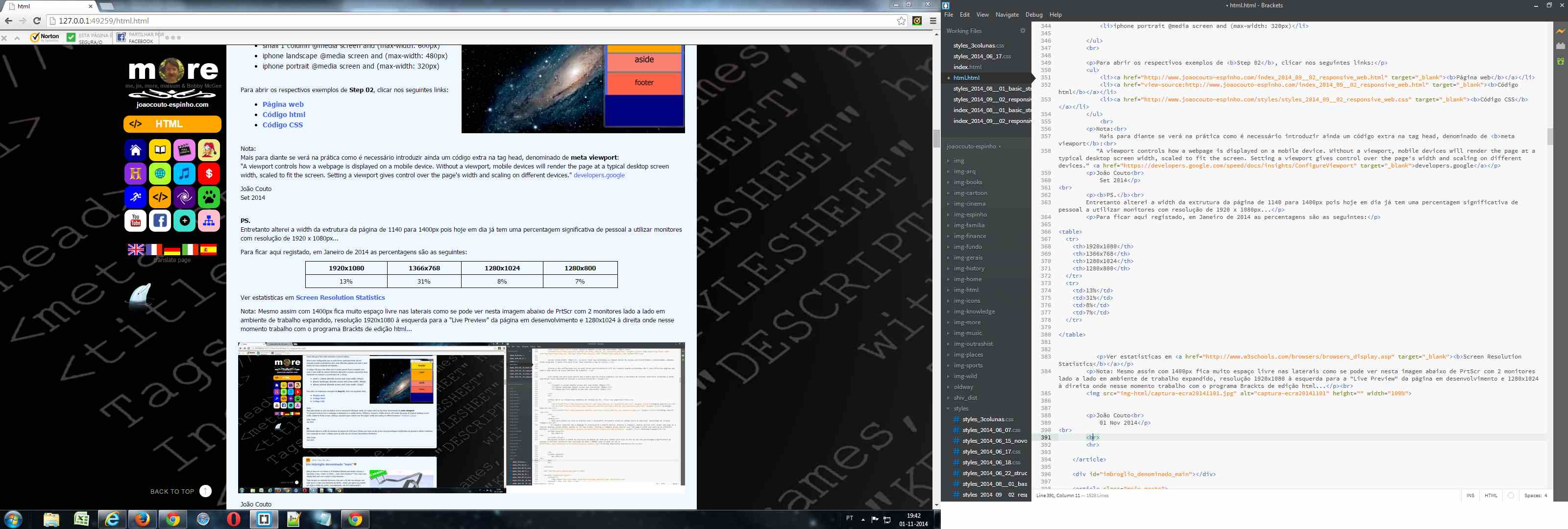
Nota: Mesmo assim com 1500px fica ainda bastante espaço livre nas laterais como se pode ver nesta imagem abaixo de PrtScr com 2 monitores lado a lado em ambiente de trabalho expandido, resolução 1280x1024 à direita onde nesse momento trabalho com o programa
Brackets de edição html e 1920x1080 à esquerda para a "Live Preview" da página em desenvolvimento...
Como habitualmente uma ação leva a outra e com esta modificação achei necessário repartir melhor a largura entre o conteudo principal 'main' e a coluna lateral direita 'aside' para 'width' entre 1500 e 1280px e assim o 'aside' passa a ter direito a 25% da largura em vez de 200px que no entanto é o valor mínimo fixo para 'width' inferiores a 1280px enquanto estilo de 2 colunas...
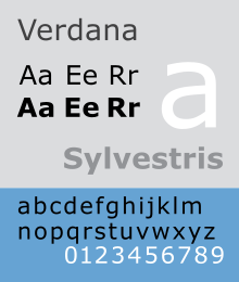
Para a 'font' selecionei 2 opções, Verdana e Tahoma sendo a primeira uma letra com mais corpo e que penso se irá adequar melhor para larguras superiores a 1280px...
Para abrir os respectivos exemplos de Step 02, clicar nos seguintes links:
João Couto
2014-11-01
Step 03_add_sections

Conforme se pode ler no site do W3C desde 28 Outubro 2014, o grupo aconselha a criação de seções através de "DIVs" em vez de utilizar o elemento section que, segundo eu percebi da recomendação, estará mais apropriado para utilização por exemplo dentro do elemento artigo... Anteriormente a esta recomendação eles deixavam isso ao critério de cada um, ou seja, poderiamos utilizar artigos dentro de sections e vice versa!...
Eu tinha em ideia criar artigos dentro de seções mas com esta última recomendação eu vejo isto ainda muito confuso e assim vou seguir com artigos dentro de divs e sem ideias por agora de utilizar o elemento section em caso algum... Aqui abaixo, duas notas que eu retiro da
W3C Recommendation 28 October 2014:
Note: Authors are encouraged to use the article element instead of the section element when it would make sense to syndicate the contents of the element.
Note: The section element is not a generic container element. When an element is needed only for styling purposes or as a convenience for scripting, authors are encouraged to use the div element instead. A general rule is that the section element is appropriate only if the element's contents would be listed explicitly in the document's outline.
Fazendo uma pesquisa rápida na web verificamos como esse tema "Div, Section or Article?" sobretudo pelo seu passado, não estará ainda muito claro e dará por agora azo a diversas interpretações ou correntes antes de um dia finalmente assentar...
Pela parte que me toca pretendo seguir a recomendação e assim vou utilizar 3 #divs para dividir cada um dos principais elementos semânticos, header, main, aside e footer, com #id para cada uma para depois facilitar entre outras coisas a estilização via CSS em folha exterior e mais para diante a adaptação aos diferentes media queries...
Quanto à tag <article> farei uso deste elemento normalmente com a class attribute para uniformizar e simplificar a estilização nas diferentes páginas...
Cada artigo será inserido dentro de uma #div com nome próprio para cada #tema para facilitar a sua identificação e localização dentro da página pois esse #id substituirá com vantagens a tag anchor com um name ou id attribute...
Importa referir que ancorâs com id não são aceites em todos os antigos browsers conforme se pode ler aqui em
Anchors with the id attribute... Use id or name?
Avançando e concluindo, uma div com id substitui uma anchor com id mas já o contrário não é válido, portanto para mim as anchor passaram à história...
Só mais umas coisinhas...
Para conseguir colocar a funcionar com um minimo de harmonia 2 colunas de highlights (área verde na imagem acima), que esticam e encolhem consoante a largura da página, tive de arranjar uma solução que ainda não sei se será definitiva ou se ainda poderá ser melhorada...
Para além do que se pode ler neste link Clearing floats tive mesmo de acrescentar um "clear" individual para cada coluna, valores "left" e "right" respectivamente... Ver abaixo em "Código CSS"
Relativamente à minha div #highlights-wrap aparece por lá um 'overflow: hidden' e um 'width: 100%' e não é por acaso... A explicação surge também nesse link Clearing floats no sub-título
The complete effect...
Isso do 'overflow: hidden' também é necessário para a área HEADER quando em MEDIA QUERIES esta assume o topo das áreas MAIN e ASIDE após 'position: relative'... Essa necessidade verifica-se quando a janela do browser encolhe e o conteúdo da header começa a assumir a posição vertical...
Ver o básico sobre 'clearing' aqui em CSS clear Property
Para abrir os respectivos exemplos de Step 03 conforme a imagem acima, clicar nos seguintes links:
Para testar e validar Step 03, clicar nos seguintes links:
João Couto
2014-11-16
Step 04_general_style
Plano

Nesta fase (IV) vou adaptar para medidas finais, ou talvez apenas semi-finais, o tempo o dirá, tudo o que se fez para trás, ou seja, widths, heights, margins, paddings, borders, etc... Por agora ainda não vou alterar/retirar as cores de identificação das diferentes áreas... De seguida vou mesmo é tratar com mais cuidado do meu CSS...
Primeiro, “fazendo” o melhor RESET possível no sentido de criar condições iguais para visualizações semelhantes nos diferentes browsers e que por desconhecimento era uma das coisas que me estava a falhar nos projectos anteriores...
Por fim, dar um toque no meu GENERAL STYLE para definir entre algumas coisas, a FONT de texto principal, os tamanhos de texto e outros como listas, links, etc... Importa referir que não será este o estilo que vai dar o aspecto final e personalizado às minhas páginas e secções de highlights, posts, asides e outros... Esse tipo de formatação ficará para as próximas fases e será para desenvolver à medida que se for adicionando conteúdo de texto e imagens criando # estilos e classes para os # sectores...
Entretanto importa perceber as vantagens de uma folha de estilos, em inglês Cascade Style Sheet ou simplesmente CSS... Alguns destaques e links aqui em New basis / CSS onde se perceberá entre outras coisas, as vantagens de utilizar a unidade "REM" para defenir tamanhos de texto e associados...
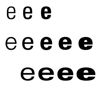
Passando à prática
Tenho visto por aí o aconselhamento do tamanho dos 6 headings mais ou menos normalizado, acabando os tamanhos mais pequenos dos cabeçalhos em valores inferiores aos próprios parágrafos, estes na casa dos 14 / 16px... Segundo a w3schools os valores por defeito para a maioria dos browsers estão de acordo com as seguintes dimensões:
    h1 = 2.000em (32px)
    h2 = 1.500em (24px)
    h3 = 1.170em (18px)
    h4 = 1.000em (16px) default value for h4 and paragraph
    h5 = 0.830em (13px)
    h6 = 0.670em (10px)
Ora então, eu vou alterar esse padrão porque preciso dos 6 tamanhos de cabeçalhos a diferenciar para cima do texto geral... Podendo ainda proceder a alguns acertos, para o meu site e partindo de um reset no css/ html da font-size para 62.5%, será contudo na base do que vai aqui a seguir:
    h1 = 3.2rem (32px)
    h2 = 2.7rem (27px)
    h3 = 2.3rem (23px)
    h4 = 1.9rem (19px)
    h5 = 1.6rem (16px)
    h6 = 1.4rem (14px)
    p  = 1.3rem (13px) / eventualmente = 1.35rem (13.5px)
Contrariando o que os entendidos dizem, p = 1em / 16px (
W3C, browsers, etc... ) o que estou a tentar fazer, no que respeita a texto básico, é seguir o que na realidade os outros fazem e me parece melhor (redes sociais, gmail, etc...)
Assim sendo estou a programar o padrão do meu texto para 1.3 / 1.35 rem (13 / 13.5 px) que aliado à font Verdana dá um tamanho óptimo para leitura e que está ligeiramente acima do que vejo por exemplo no Facebook cuja font me parece ser a Thaoma se não me engano com 12.5 ou 13px... Essa já foi a minha escolha quando antes trabalhei esses valores em % (80% de 16px = 12.8px) para max-width 1140/1200 mas agora vou seguir com a unidade REM (62.5% de 16px = 10px = 1.0rem) e um tipo de letra com um pouco mais de corpo para screen resolution superiores a 1280 e já não estou a pensar em alterar esse padrão para resoluções inferiores mas o tempo e a experiência o confirmarão...
Para cabeçalhos gosto da Arial Black como base contudo esta cria alguns problemas no Firefox (") para os quais não encontro outra solução que não seja a de a defenir de outra forma, apenas como Arial mas com font-weight:900... Para comprovar as diferenças, abrir
arial weights em Firefox e comparar depois em outros browsers...
Para tamanhos de heading menores, irei personalizar eventualmente com o atributo classe ou caso a caso quando necessários...
Tomando por modelo esta página dedicada ao tema HTML para os 6 headings e parágrafos a ideia é esta:
| Exemplo |
Desc |
tag |
size |
HTML
|
título da página |
h1 |
32px |
Bla Bla Bla
|
título da secção
(div) |
h2 |
27px |
Step by step
|
título do artigo |
h3 |
23px |
Step 04_general_style
|
sub-título do artigo |
h4 |
19px |
Passando à prática
|
2º sub-título do artigo |
h5 |
16px |
I, II, III
|
3º sub-título do artigo |
h6 |
14px |
|
estou a programar o padrão do meu texto para 1.3 / eventualmente 1.35rem (13 / 13.5px)...
|
parágrafo + bold |
p + b |
13px |
|
Tomando por modelo esta página dedicada ao tema HTML...
|
parágrafo |
p |
13px |
| Tomando por modelo esta página dedicada ao tema HTML... |
small text |
small |
10.5px |
Nota:
Vou avançar para o Step 05 sem dar por concluido o Step 04 pois no que respeita a reset e normalização haverá sempre novos desenvolvimentos e eu estou aberto tanto ao que por agora desconheço como ao que de futuro vier de melhoramento nesses dois campos...
Quanto ao meu GENERAL STYLE, sobre as tags abordadas pode ver-se alguma informação resumida aqui em
Step 04 Page Index ou no link 'Página Web' já aqui abaixo...
Entretanto estou na dúvida entre os 13 e os 13.5px para o meu texto geral, esteticamente gosto mais dos 13 mas os 13.5 são uma hipótese a considerar no sentido de facilitar a leitura pelo que antes de me decidir penso ir alternando um e outo e ir comparando com outros sites e só lá mais para a frente acabar com esta indecisão, se é que algum dia este assunto seja susceptível de ficar mesmo encerrado...
Links para os exemplos de Step 04
Para testar e validar Step 04 clicar nos seguintes links:
João Couto, 2014-11-23
Last edited, 2015-01-03
step 06_styling_main
Plano

A área 'main' é onde vai inserido o conteúdo principal e normalmente também o mais extenso do site... No meu caso é importante nesta área o cabeçalho porque leva um título em 'h1' e uma imagem alusiva para além de uma imagem personalizada com golfinhos e é no geral muito importante toda a zona central desta área pois é onde serão inseridos os principais 'artigos' tais como por exemplo, este próprio...
O plano para esta área consiste em fazer copy / past do conteúdo já existente e estilizar de novo, de alguma forma aproveitando o trabalho anterior mas tentando fazer também alguns melhoramentos no que respeita ao CSS e como já disse atrás, estou a pensar também colocar menos conteúdo por página, ou seja, vou tratar de dividir as páginas em secções como por exemplo para este tema HTML nas seguintes 3 secções incluidas num indíce de página: Higlights + Bla Bla Bla + Searching for the Theory...
Uma das metas que me coloco resume-se a estas duas palavras, 'menos código' e não vou dizer que isso é tarefa fácil... Como exemplo vou referir o caso das imagens para as quais gostaria de tentar algumas classes de estilo de modo a atingir o máximo possível de imagens mas isso trás outros problemas associados pois um dia posso querer alterar apenas algumas imagens e estar na verdade a atingir muitas outras indesejavelmente... No entanto algumas classes importantes serão mesmo assim bastante simples tais como .img100 basicamente apenas com "width:100%", .img50-l "width:50%; float:left" e uma .img50-r "width:50%; float:right"...
Prática
Isto agora vai ficar mais chato e não é para vir para aqui alguém ler, é apenas para mim pois a memória vai falhando e preciso deixar registo do que faço para mais tarde se necessário voltar a entrar rápido no assunto...
Vou começar por criar os espaços livres entre esta área central 'main' e as 2 colunas laterais com um padding de 1% para cada lateral... Poderiam ser 10px fixos para cada lado mas como a janela é "elástica" vou definir também os espaços ajustáveis... 1% de 1000 = 10px, mas 1% de 750 = 7.5px e isso faz alguma diferença...

Relativamente aos Media Queries, o 1º ajuste para esta fase é anular o padding left de 200px da div container pois quando a página assume o formato 2 colunas esses 200px reservados para a coluna fixa da esquerda deverão ser tomados pelo conteúdo principal, ou seja, highlights ou posts + aside... Para o mesmo efeito importa aqui também anular o padding-left de 1% da área 'main' e só deverá ser anulado o 1% da direita quando pelos Media Querie a página assume uma só coluna aos 760px sem a área aside na direita...
Abaixo dos 600px de largura da página web as áreas highlight deixam de flutuar e assumem o width de 100%...
Um outro problema resolvido
Entretanto reparei que os links nesta área 'main' após visitados ficavam erradamente de cor branca o que não faz sentido nenhum sobre um fundo também ele quase branco (podem ver-se ainda em step_05 os links vizitados ficarem brancos, embora sobre fundo negro) nomeadamente os títulos em h3 dos highlights quando efectivamente eu os programei para uma outra diferenciação passando da cor royalblue antes de visitados para um agora mais marcante purple após visita...
Fui atrás verificar de onde poderia vir o erro e encontrei-o onde não esperava... A cor branca está realmente programada em 'a:visited' no link joaocouto-espinho.com visivel no canto superior esquerdo mas isso não deveria afectar outros sectores contudo era mesmo daí que vinha o problema... Para poupar espaço, não querendo repetir 3x color: white, eu havia colocado o código em linha separado por virgulas como aqui exemplificado, #euwww a:link, a:visited, a:active { color: white; } e para resolver o problema tive agora de reescrever o código separadamente para os 3 casos...
Assim se constata como um código CSS aparentemente correcto e a funcionar pode no entanto inconvenientemente alterar por abrangência toda uma página web... Aqui abaixo fica a imagem do meu código já devidamente corrigido de modo a funcionar apenas para a área pretendida, neste caso #euwww, não afectando indevidamente outras secções...

P.S.
Corrigindo... Para este caso não é realmente necessário repetir o color: white, bastaria completar o código conforme abaixo exemplificado:
      #euwww a:link,
      #euwww a:visited,
      #euwww a:active {
          color: white;
      }
Links para os exemplos de Step 06 styling_main
Para testar e validar Step 06 clicar nos seguintes links:
João Couto, 2015-01-25
Last edited, 2015-03-07
Step 07_styling_aside
Plano

A área <aside> é normalmente colocada do lado direito da página e no meu caso não será diferente contudo assim que a janela do browser encolhe para formatos tipo tablete ou telemóvel no meu site esta área será programada através do CSS / MEDIA QUERIES para aparecer na parte inferior entre as áreas <main> e <footer>...
A exemplo das outras áreas semânticas, o meu <aside> também está dividido em 3 #divs, top, center e bottom... Entre algumas vantagens a mais importante poderá ser a diferenciação e facilitação do código CSS nomeadamente com vista à programação dos MEDIA QUERIES como se tem observado e praticado em passos anteriores...
O espaço ASIDE é essencialmente utilizado para agrupar informação secundária e complementar relacionada ao tema principal da própria página e para links de sites e páginas seleccionadas mas isso não será regra e por certo a utilizarei para aquilo que eu entender por bem colocar em destaque...
Já agora, sobre esse assunto pode ler-se o que dizem os tipos do 'html5 Doctor' neste artig
Aside Revisited...
Áreas coloridas
Propositadamente para este passo 'Step 07_styling_aside' vou deixar as seguintes áreas principais com cores de fundo para melhor percepção dos respectivos espaços... Clicando na imagem acima abrirá a respectiva página...
- <header> .... cor = ouro
- <main> ...... cor = laranja
- <aside> ..... cor = salmão
- <footer> .... cor = tomate
Font family
Para o espaço 'aside' vou escolher a fonte 'ARIAL' pois é
mais compacta do que a 'verdana'...
Para este tipo de larguras, coluna estreita, é também importante ter uma propriedade do tipo
'word-wrap: break-word' para permitir quebra de palavras inquebráveis ou seja, permite que palavras longas quebrem e continuem na próxima linha... Isto será válido por exemplo para links longos que eventualmente queira postar por inteiro dentro da largura minima dos 200px...
Também uma 'text-align: center' para o 'aside' deverá simplificar o código... O conteúdo que vai ficar descentrado pode ser programado para cada área individualmente com uma 'text-align: left'...
Page Index
Como já antes programado em 'Step 05_styling_header' a minha 'Page Index' irá desaparecer do espaço 'header' coluna fixa na esquerda e aparecer à direita no 'aside' quando a janela do browser apresentar valores de altura inferiores a 900px... Independentemente da largura do browser, e consequentemente do aside, a largura do espaço ´Page Index' será de 200px conforme a área a azul da figura acima...
Width
A minha 'aside' vem já programada detrás, desde o meu 'Step 02_responsive_web', com uma largura ajustável de 25%... No máx. são cerca de 325px ou seja, 25% de (1500 max pagewrap -200 header)... Contudo quando a janela do browser encolhe e a página em formato 3 colunas passa agora para valores de width inferiores a 1051px a 'aside' está programada através dos 'media queries' para assumir o valor fixo de 200px que se vai manter enquanto formato 2 colunas abaixo dos 1050px até justo à passagem ao formato de 1 coluna aos 760px de width...
Os 1051px/1050px são os novos valores encontrados para proporcionar uma passagem mais equilibrada do aside de 25% para 200px e mesmo para a passagem ao formato 2 colunas... Essas duas transformações estavam antes programadas para acontecer aos 1200 e aos 1050px respectivamente mas isso implicava um salto algo desagradável de bastantes pixels na configuração e agora com os valores de 1051 e 1050px a coisa está relativamente suavizada e salvaguardada...
Para ajudar a suavizar o efeito de transformações, que inclui também a passagem do pageindex da header para o aside aquando de alturas inferiores a 900px, reprogramei também o max-pagewrap estabilizado agora nos 97% até aos 760px de width e só daí para baixo assumirá valores de 97,5% para cima...
Estes últimos valores justificam-se da seguinte forma:
- aside width = 25% = 1/4 de (pagewrap - header)
- aside min. width = 200px
- 200 x 4 = 800px
- 800 + 200 (header) = 1000px
- 1000 / 97% (max-width da pagewrap) = 1031px
- 1031 + 20 (*) = 1051px
Nota: (*) Após teste prático verifica-se que com 1031 a coisa não funciona perfeita sobretudo devido à #div 'asidepageindex', nem com +10, mas está óptima com os +20 = 1051px
Entretanto já percebi que essa diferença de 20px vem do facto de termos uma barra de scroll do lado direito que na verdade "rouba" cerca de 19px à largura útil da janela do browser... Por agora vou ficar pelos 1051/1050 mas de futuro posso alterar para 1061/1060 ou outros...
Links para os exemplos de Step 07 styling_aside
Para testar e validar Step 07 clicar nos seguintes links:
João Couto, 2015-03-07
Last edited, 2015-04-03
Step 09_ended_page
Plano

Apresentar a página o mais próximo possível do aspecto final, essencialmente sem as cores de fundo utilizadas durante as anteriores 8 fases de construção da página web protótipo e que foram muito úteis para a identificação das diferentes áreas e secções enquanto estas eram trabalhadas...
Acção
Fazer a limpeza na página CSS do código de apoio com muitos 'background-color' entre outros também agora desnecessários e fazer algumas afinações e retoques para melhorar o funcionamento e aspecto final da página sobretudo na parte do código dedicado aos Media Queries...
Futuro?
O passo seguinte, depois de afinar o modelo deste Step 09, entre outras coisas colocando todos os links a funcionar, será o de multiplicar as outras páginas do site nomeadamente as que fazem parte do meu menu de navegação... Depois disto vou ver melhor como funciona isso do
Bootstrap pois no site da w3schools os elogios são muitos e a coisa parece muito interessante...
Links para os exemplos de Step 09 ended_page
Para testar e validar Step 09 clicar nos seguintes links:
João Couto, 2015-04-25
Last edited, 2015-04-25
P.S.
Esclarecendo... Estes links de Step_01 a Step_09 vão ficar por aqui para registo mas estão já ultrapassados por novos desenvolvimentos...
As páginas constantes do meu site menu deverão assumir progressivamente o modelo desta página "</> HTML"... Quanto a subpáginas, tenho ideia de as construir, senão todas pelo menos algumas, segundo as ferramentas Bootstrap que por agora me interessa também desenvolver... Ver Bootstrap em my ABC for HTML
João Couto, 2015-08-30
html / bla, bla, bla...
Um imbróglio denominado "main"

Esta já deve ser no minimo a 3ª tentativa falhada para tentar colocar a funcionar o meu <main> a 100%... mas o IE é mesmo f***do e nem com display blok nem com a shivs a coisa funciona...
Tudo ok para os restantes browsers mas sem o IE não vou avançar com este que é o mais novo elemento do html5... Assim por agora vou manter em ação a minha div_zinha, concretamente <div id="maincontent">
Entretanto, com curiosidade e certa perplexidade, verifico o facto de por estas alturas também os principais dinamizadores deste elemento não terem já avançado com os novos elementos semânticos... Passando uma vista de olhos pelo código de fonte da página da w3.org/ encontramos algumas pérolas, tais como:
 <div id="w3c_main">
 <div class="main-content">
 <div id="w3c_footer">
 <div id="w3c_mast"><!-- #w3c_mast / Page top header -->
Como se pode ver, são divs por todo o lado o que já não me surpreende depois de ver também o DOCTYPE... ver abaixo em view-source, linha 89
view-source
www.w3.org/
Qual é o truque?
Sim, tem aí qualquer coisa que eu ainda não descobri pois na realidade encontramos online muitos sites onde se pode ver o <main> a funcionar perfeitamente com o IE... Qualquer um o pode comprovar abrindo no seu PC com o IE sites como o
html5doctor,
sitepoint, etc...
PS.
Eu não desisto fácil, o truque parece que já o encontrei e é um simples <main role="main"> mas entretanto penso que vou desistir do <main> por uns tempos pois o que agora li não é nada encorajador e a verdade é que se a coisa está a funcionar relativamente bem com uma <div> para quê complicar...
Browser compatibility
As a newly-proposed feature of HTML, the <main> element is not yet supported widely. You are strongly urged to add the "main" ARIA role to any <main> element:
 <main role="main">
 ...
 </main>
//developer.mozilla.org/en-US/docs/Web/HTML/Element/main
O imbróglio
Isto agora complicou-se pois o problema é que para além do Internet Explorer para o desktop temos ainda de contar, entre outros, com o Android para mobile que se encontra igualmente na cor vermelha de Not supported pelo que mais vale estar quieto por agora no que se refere ao <main>... ver aqui acima no link developer.mozilla.org em 'browser compatibility'
Edited, 07 Jun/2014
PS.
Se uma simples virgula pode alterar o teor de uma frase então no html nem vos digo a dor de cabeça que pode significar... Pois o meu "main" nunca mais funcionaria com o IE enquanto eu não tivesse reparado por um acaso que estava ali uma virgula a mais na minha CSS a anteceder o display: block
 article, aside, figure, footer, header, main, nav, section, {
     display: block;
 }
Edited, 2014-06-22
Nota: Ver últimos desenvolvimentos em New basis...
The main element
html / bla, bla, bla...
Os browsers da m***a

Faltam alguns ajustes mas o principal está feito, a optimização do site para os # Media Queries...
Tive de dar uma reviravolta na estrutura mas valeu a pena porque as coisas ficaram agora como eu idealizei de início, ou seja 3 colunas sendo a coluna da esquerda fixa para o menu de navegação mas agora adaptável para 2 e até para uma só coluna para o caso de menores resoluções de ecrã como é o caso dos tabletes e dos telemóveis... É o denominado design da Web responsivo e encontram-se na net montes de links sobre o assunto... Deixo aqui este que tem a opção de lingua pt ...
alistapart.com/article/responsive-web-design
Contudo, isto ainda não é só flores e para resolver alguns imbróglios por vezes tenho de dar voltas ao miolo... É o caso presente de eu estar a trabalhar o meu site na plataforma
Brackets que funciona em tempo real, ferramenta denominada Live Preview mas que só funciona desse modo com o browser Google Chrome... Ora acontece que depois vou testar noutros browsers e vejo resultados bastante diferentes como se pode ver nessa imagem acima, o botão BACK TO TOP quando a imagem do site encolhe para menos de 1000px aparece como eu idealizo no Chrome, imagem da direita mas depois no IE e no Firefox aparece distorcido, exemplos à esquerda...
A solução deve passar por colocar o código do botão fora do <footer> pois já percebi que anulando o padding-bottom de 5px do footer para max-with 1000px resolve o problema no Firefox e parcialmente no IE mas desajusta-se no Google Chrome...
Quando será que finalmente estes gajos dos browsers acertarão todas as agulhas... É que tá difícil brincar assim pá, um tipo não aguenta...
Joao Couto
2014-05-11
html / bla, bla, bla...
Responsive web design


E aí está, aproveitando o feriado de 6ª feira Santa de Páscoa e com base nas dicas desse link do Ralph Phillips 'Responsive Web Site with Media Queries: Change 2 Columns to 1 Column' fiz a minha adaptação com relativo sucesso...
Com problemas no Mozilla, a mecânica para os restantes browsers está a funcionar bem e assim, para larguras inferiores a 990px, o site deixa de ter como fixa a coluna lateral onde está inserido o menu principal que passa a funcionar no topo da página... O importante era mesmo a mecânica, large x small... As afinações, arranjos estéticos e outros ficam para depois...
Tem outos videos recentes do Ralph para ver com mais tempo e tirar melhor partido mas por agora a dica principal foi esta: @media screen and (max-width: 990px)
João Couto
2014-04-18
PS:
Com max-width: 990px funciona perfeito no PC mas após testar no telemovel verifiquei que não se consegue neste o melhor efeito pelo que alterei para os 800px...
... mas entretanto os novos conhecimentos adquiridos levaram-me até um tal de <meta name="viewport" ... >
Ver mais em Using the viewport meta tag to control layout on mobile browsers
html / bla, bla, bla...
Dúvidas ultrapassadas...

A ideia era já ter avançado para o HTML5 a 100% mas tenho tido algumas dúvidas de quando seria o momento certo e esse é um dos motivos que me tem atrasado por agora... Aqui há uns meses atrás estava no PC do meu irmão Tó-Zé e verifiquei como tudo fica distorcido com as novas tags em browsers mais antigos, nomeadamente as tags <nav>, <header> ou <footer> entre outras... A solução, um simples {display:block}, encontrei-a num dos links aí abaixo
botecodigital e está comprobada no site da
w3schools também abaixo linkado...

Também a estrutura do site me tem consumido em dúvidas mas entretanto entre outras situações fui-me apercebendo que cada vez mais o futuro passa pelos dispositivos móveis que em breve vão ultrapassar os PCs como a forma mais popular de navegar na web, se é que isso já não aconteceu, portanto, deixemo-nos de idealizar para largos wides...
Estas minhas dúvidas ficam assim praticamente ultrapassadas e para se perceber um pouco melhor a coisa, aqui ficam algumas pistas:
João Couto
2014-03-22
PS: Aqui abaixo uma das soluções que eu procurava.
html / bla, bla, bla...
HTML5 finalmente!

Decidi-me, alterei e publiquei a minha 1ª página construída agora na base do HTML5 / CSS3...
Inicialmente, em maio passado, tinha isso em meta apenas para o início do próximo ano... O tempo disponível é pouco mas isto não é assim tão complicado e com os conhecimentos adquiridos senti que metendo mãos à obra iria poupar tempo no futuro pois na verdade, este novo html é na essência muito mais controle via css e isso faz por certo toda a diferença...
Quando mais para diante tiver esta Home Page controlada e afinadinha, header, footer, etc, partirei então para a multiplicação de páginas...
João Couto
2013-11-24

A imagem de fundo desta página Home estava bastante pesada, 629kb, o que tornava a sua abertura um pouco mais demorada... Assim, alterei-a para um tamanho mais amigável para a web, 139kb, e aproveitei também para a clarear um pouco e para lhe diminuir a largura para os 1920px...
Após as alterações testei de seguida o resultado em 5 browsers, Chrome 31.0, Safari 5.1.7, Opera 18.0, Firefox 25.0 e IE 11.0 e, como habitualmente, o efeito final raramente é uniforme... Desta vez está a falhar a actualização da imagem de fundo no IE e no Chrome... Na verdade, não sei como resulta em outros PC's e em browsers não actualizados...
Aproveitei ainda que estava com a mão quente, para fazer um GIF animado com 4 imagens de Espinho para a minha imagem de apresentação no topo da 1ª página...
Entretanto, passada uma meia hora, voltei a abrir a página nesses dois browsers e já está a dar ok... Deve ter sido uma questão de cookies...
João Couto
2013-12-08
html / bla, bla, bla...
Se bem me lembro...

Corria o ano de 2010, estava eu no Facebook à conversa com o Zé Bargueño a queixar-me precisamente das limitações do programa, pois se queria voltar a ver qualquer assunto ou ouvir qualquer coisa antes publicada isso era um enorme problema de tempo e de paciência...
Depois disso surgiu-me a ideia de associar texto a imagem pois o FB permite criar albuns de fotos e assim passei a organizar o meu arquivo com base em imagens... Criei assim o album das capas dos discos da minha vida, o album de fotos antigas de Espinho entre outros...
Mais tarde os tipos do FB geraram uma ordem cronológica das nossas publicações mas eu achei aquilo sempre muito limitado...
Tudo isto para dizer por fim que essa foi uma das razões que me levaram a afastar cada vez mais do FB e que, na minha humilde opinião, não há nada como ter a nossa própria organização, o nosso próprio site...
Joao Couto
2013-07-20
PS: Mesmo que por uns tempos desorganizado...
html / bla, bla, bla...
Olá pessoal amigo!

Já cá estou na web com "o meu site", ainda agora começei e esta já é a minha nova paixão... Tinha esta meta em ideia para um dia mais tarde mas, por um daqueles acasos da vida, isto começou mais cedo... É que faz agora meia dúzia de meses, ía eu para um curso de desenho e dei com a oportunidade de aprender como funciona isto da web...
Não estou agora aqui para dizer que o site está em construção porque na verdade já está acabado, isto é, o que fiz até agora está feito, está até com alguma desordem, e é o que se pode ver nestas páginas, está online...
No entanto, o que aprendi até agora, sobretudo através de pesquisa na net, permite-me partir desde já para o HTML5 e o que fizer daqui para diante será concerteza em outras bases...
Estas páginas agora publicadas precisam contudo de algumas correcções, como por exemplo com links que não encaminham directo para as respectivas páginas ou com imagens que não aparecem online... Vou depois tentar descobrir porque isso acontece porque na verdade tudo funciona bem quando visualizo no meu browser...
Outos erros já remediei, como foi o caso com as instruções de folha externa de estilos da página de "Musica" que não actuou após a publicação na net e tive assim de passar para instruções pelo sistema de método interno na tag <head>... Não tive por agora pachorra para tanto mas mais tarde vou tentar descodificar também porque isso aconteceu...
Para mim, o importante foi mesmo chegar até aqui porque daqui para a frente vai ser sempre a "abrir"... Como diria o brasileiro, "ouviu galera", ou talvez mais apropriado, "beleza"... eheheh

Nesta página "Home" a ideia foi, e possivelmente continuará a ser no novo projecto, dar a conhecer as últimas publicações de cada página, e naturalmente, fazer alguns destaques...
Joao Couto
2013-06-24


Bla, Bla, Bla
html / New basis ...
New basis for the development of my site

Searching for the theory...
... in order to incorporate the new semantic tags of HTML5 with a new structure and use it in # media queries, in other words, multiple devices like: iPhones, android devices, iPads, etc...
Novas bases para o desenvolvimento do meu site
Em busca da teoria...
... para o desenvolvimento do meu site a fim de incorporar as novas tags semânticas do HTML5 com uma nova estrutura e usá-lo no meu telemóvel ...
João Couto
2014-04-25

New basis / Index
- HTML Basis
- HTML <!DOCTYPE> Declaration
- HTML Language Code Reference
- meta tags for HTML 5
- How to target old versions of IE
- CSS - Cascading Style Sheets
- HTML Style
- The main element
- Sections - Article or section?
- Introduction to CSS Media Queries
HTML5 IS A W3C RECOMMENDATION
2014 October 28
The HTML Working Group today published HTML5 as W3C Recommendation. This specification defines the fifth major revision of the Hypertext Markup Language (HTML), the format used to build Web pages and applications, and the cornerstone of the Open Web Platform...
See more at ⇒
HTML5 IS A W3C RECOMMENDATION
... and, before we go forward, we must see some important rules at:
html / New basis ...
HTML basis
Searching for the theory...

W3Schools.com
With HTML you can create your own Web site.
HTML is easy to learn - You will enjoy it.
To learn efficiently HTML, anyone can start with this link
HTML HOME and then follow by
HTML Introduction,
HTML Editors,
HTML Basic, etc...
See all links on the left side of those pages from
w3schools.

HTML.net
Another good web to learn the basis of HTML is from HTML.net
"People often think it is extremely difficult to make a website. That is not the case! Everyone can learn how to make a website. And if you read on, you will have made one in just one hour."
See more at
Introduction - Free HTML Tutorial
Em busca da teoria...
Para aprender HTML em português, tem aqui este link
Introdução ao HTML também do site HTML.net...
"As pessoas imaginam que é muito difícil construir um website. Isto não é verdade! Qualquer um pode aprender como construir um website. Se você continuar lendo, estará apto a construir um website em uma hora."
Ver Tutorial HTML completo nos links à esquerda dessa página web acima ou por lições (15) neste link
HTML.net
html / New basis ...
HTML <!DOCTYPE> Declaration

Definition and Usage
The <!DOCTYPE> declaration must be the very first thing in your HTML document, before the <html> tag.
The <!DOCTYPE> declaration is not an HTML tag; it is an instruction to the web browser about what version of HTML the page is written in...
Read more at
w3schools
Recommended Doctype Declarations to use in your Web document
When authoring document is HTML or XHTML, it is important to Add a Doctype declaration. The doctype declaration must be exact (both in spelling and in case) to have the desired effect...
For HTML 5 [NOT a standard yet]
Read more at
w3.org
The doctype declaration
...
So now you learned three things:
- How to view the source code of a page, an important tool.
- You know one word in HTML5: <!DOCTYPE html> = "HTML5"
- and one grammar rule: <!DOCTYPE html> goes at the top of every page.
Read more at
html-5-tutorial.com
João Couto
Sept 2014
... and before we go forward, we must see recommendations at:
Accumulated knowledge in this stage,
for the developing of my web pages
The doctype declaration for HTML5
 <!DOCTYPE html>
 <html>
 ...
 </html>
Now, 28 October 2014 ... HTML5 IS A W3C RECOMMENDATION
html / New basis ...
Language Code Reference

The primary language of the page should correspond with the human language of the page
The HTML lang attribute can be used to declare the language of a Web page or a portion of a Web page.
This is meant to assist search engines and browsers.
According to the W3C recommendation you should declare the primary language for each Web page with the lang attribute inside the <html> tag, like this:
  <html lang="en">
  ...
  </html>
Some French text in a paragraph:
<p lang="fr">Ceci est un paragraphe.</p>
If you want to specify the language of some content but there is no markup around it, use an element such as <span> or <div> around the content.
 <html lang="en">
 ...
    <p>You'd say that in Chinese as
        <span lang="zh-Hans">
            中国科学院文献情报中心
        </span>.
    </p>

Para qualquer mudança de idioma no conteúdo textual utilize o atributo lang para indicar qual é o idioma do trecho em questão.
Com isso, leitores de tela que suportam diferentes linguagens lerão o trecho de acordo com o idioma indicado e não de acordo com o idioma padrão ou o que foi definido para todo o documento na tag <html>.
 <html lang="pt-br">
 ...
     <p>O personagem diz
         <span lang="it">
             "Buon Giorno Principessa"
        </span>
     </p>
access-defaults.blogspot.pt/2013/05/internacionalizacao
w3.org/standards/webdesign/i18n
All atributes support only 1 language so I believe you should define only 1 language, the most important language should be set, this can't be done if you have multiple languages on a single document, so here is the info to solve your problem:
The lang and xml:lang attributes do not allow you to assign mulitple languages to a single document. So if you're writing a Web page with multiple languages you have two options:
- Define a primary language with the lang attribute, and then call out the secondary language(s) with lang attributes on elements in the document
- Leave out the lang attribute, do not use them and define it in the various divisions of the document.
I have some multiple language pages and I do use the 2nd option...
example for language info in elements:
 <div lang="fr-CA" xml:lang="fr-CA">
     Canadian French content...
 </div>

 <div lang="en-CA" xml:lang="en-CA">
     Canadian English content...
 </div>

 <div lang="nl-NL" xml:lang="nl-NL">
     Netherlands, Dutch content...
 </div>
Edited, Apr/2014
Accumulated knowledge in this stage,
for the developing of my web pages
Declaring the primary language
 <!DOCTYPE html>
 <html lang="pt">
 ...
 </html>
html / New basis ...
Meta Tags for HTML 5
4.2.5 The meta element
w3.org
...
The meta element represents various kinds of metadata that cannot be expressed using the title, base, link, style, and script elements.
...
4.2.5.1 Standard metadata names
- application-name
- author
- description
- generator
- keywords
...
Note: Many search engines do not consider such keywords, because this feature has historically been used unreliably and even misleadingly as a way to spam search engine results in a way that is not helpful for users.
4.2.5.5 Specifying the document's character encoding
...
Note: Using non-UTF-8 encodings can have unexpected results on form submission and URL encodings, which use the document's character encoding by default.
See all of meta element at ⇨
w3.org or at ⇨
spec.whatwg.org
See also HTML/Elements/meta at ⇨
w3.org/wiki
HTML <meta> Tag
w3schools.com
Example
Describe metadata within an HTML document:
<head>
    <meta charset="utf-8">
    <meta name="description" content="Free Web tutorials">
    <meta name="keywords" content="HTML,CSS,XML,JavaScript">
    <meta name="author" content="Hege Refsnes">
</head>
Definition and Usage
Metadata is data (information) about data.
The <meta> tag provides metadata about the HTML document. Metadata will not be displayed on the page, but will be machine parsable.
Meta elements are typically used to specify page description, keywords, author of the document, last modified, and other metadata.
The metadata can be used by browsers (how to display content or reload page), search engines (keywords), or other web services.
See more at: ⇨
w3schools.com
See also at w3schools
HTML <title> Tag
Create Accurate & Descriptive Meta Tags
ifood.tv/blog
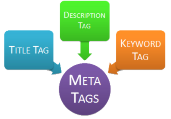
A Meta Tag is an HTML tag that you create for a web page. It contains information about the page's content. Search engines will use this information.
There are numerous types of meta tags, but we are going to talk about three important ones that you should be optimizing: Title Tags, Description Tags and Keyword Tags.
You should have descriptive and accurate meta tags for each of your pages. This is something you should talk to your web designer about if you do not manage your own site.
See more at: ⇨
ifood.tv/blog
How To Use HTML Meta Tags
Search Engine Watch

What Are Meta Tags?
HTML meta tags are officially page data tags that lie between the open and closing head tags in the HTML code of a document.
The text in these tags is not displayed, but parsable and tells the browsers (or other web services) specific information about the page. Simply, it “explains” the page so a browser can understand it.
The matters in this article:
- The Title Tag
- The Description Meta Tag
- The Keywords Meta Tag
- Robots Meta Tag
- The Charset Tag
See article at: ⇨
searchenginewatch.com
meta name="keywords"
Google does not use the keywords meta tag in web ranking
googlewebmastercentral.blogspot
...At least for Google's web search results currently (September 2009), the answer is no. Google doesn't use the "keywords" meta tag in our web search ranking...
Q: Does Google ever use the "keywords" meta tag in its web search ranking?
A: In a word, no. Google does sell a Google Search Appliance, and that product has the ability to match meta tags, which could include the keywords meta tag. But that's an enterprise search appliance that is completely separate from our main web search. Our web search (the well-known search at Google.com that hundreds of millions of people use each day) disregards keyword metatags completely. They simply don't have any effect in our search ranking at present.
Q: Does this mean that Google will always ignore the keywords meta tag?
A: It's possible that Google could use this information in the future, but it's unlikely. Google has ignored the keywords meta tag for years and currently we see no need to change that policy.
See more at:
Matt Cutts, Search Quality Team googlewebmastercentral.blogspot.pt
See others about meta name keywords at:
How to use the meta tag "KEYWORDS"
metatags.info
Suggested meta tags for HTML 5
that should be considered a must have
stackoverflow.com/questions
Question
I am looking at migrating over pages written in XHTML 1.0 to HTML 5 and am looking at the minimum requirements when including meta tags in the <head> element... Are the following sufficient for HTML 5 ... ?
Answer 1
According to
//validator.w3.org/ the following is an absolutely minimal example of a valid HTML5 document, literally everything else is optional.
<!DOCTYPE html>
<html>
    <head>
        <meta charset="utf-8">
        <title>Valid HTML5 Document!</title>
    </head>
</html>
So, you absolutely must have the charset meta tag defined, and everything else is a matter of accomplishing your goals (search engine related stuff, cache control, etc).
Answer 19
There is no such thing as minimum meta tags (unless of course I got your question wrong). As far as I am aware no meta tag is required and the ones you add are the ones for your specific needs.
Consider the following document:
<!DOCTYPE html>
<html>
    <head>
        <title>Some Title</title>
    </head>
    <body>

    </body>
</html>
You can validate it and not get any warning whatsoever. The validator just reminds you that the default encoding is missing. This is not even a warning, just an information.
The
working draft has this to say about meta tags:
The meta element represents various kinds of metadata that cannot be expressed using the title, base, link, style, and script elements.
And it goes on:
4.2.5.1 Standard metadata names
application-name, author, description, generator, keywords
Further it mentions some additional tags concerning a page's status, contextual representation and character encoding.
Although none of these ar explicitly required by the standard, there are in fact best practices, especially concerning search engine optimization (SEO). This has nothing to do with the HTML standard but with web (search) crawlers.
You can get some good advice which meta tags matter (for Google) at the
Webmaster Tools meta tag support page
See more at: ⇨
stackoverflow.com/questions
Meta tags that Google understands
support.google.com
Meta tags are a great way for webmasters to provide search engines with information about their sites. Meta tags can be used to provide information to all sorts of clients, and each system processes only the meta tags they understand and ignores the rest...
Google understands the following meta tags (and related items)...
- <meta name="description" content="A description of the page" />
- <title>The Title of the Page</title>
- <meta name="robots" content="..., ..." />
- <meta name="google" content="nositelinkssearchbox" />
- <meta name="google" content="notranslate" />
- <meta name="google-site-verification" content="..." />
- <meta http-equiv="Content-Type" content="...; charset=..." />
- <meta charset="..." >
- <meta http-equiv="refresh" content="...;url=..." />>
See video, item descriptions and more at ⇨
support.google.com
Ver o mesmo artigo em pt-PT
Metatags que o Google entende
Configure the Viewport
developers.google.com

This rule triggers when PageSpeed Insights detects that your page does not specify a viewport, or specifies a viewport that does not adapt to different devices.
Overview
A viewport controls how a webpage is displayed on a mobile device. Without a viewport, mobile devices will render the page at a typical desktop screen width, scaled to fit the screen. Setting a viewport gives control over the page's width and scaling on different devices.
Recommendations
Pages optimized to display well on mobile devices should include a meta viewport in the head of the document specifying
width=device-width, initial-scale=1.
<meta name=viewport content="width=device-width, initial-scale=1">
See additional information at ⇨
developers.google.com
More information at ⇨
Using the viewport meta tag to control layout on mobile browsers
X-UA-Compatible Meta Tag
stackoverflow.com
If you currently use the x-ua-compatible header to target a legacy document mode, it's possible your site won't reflect the best experience available with IE11...
See more at ⇨
What's the difference if...
See more about X-UA-Compatible meta tag at:
X-UA-Compatible Meta Tag webdesign.about.com
Does meta http-equiv=“X-UA-Compatible” content=“IE=edge” impact on non-IE explorer? stackoverflow.com
SEO
support.google.com
Do you need an SEO?
SEO is an acronym for "search engine optimization" or "search engine optimizer." Deciding to hire an SEO is a big decision that can potentially improve your site and save time, but you can also risk damage to your site and reputation...
No one can guarantee a #1 ranking on Google.
Beware of SEOs that claim to guarantee rankings, allege a "special relationship" with Google, or advertise a "priority submit" to Google. There is no priority submit for Google. In fact, the only way to submit a site to Google directly is through our Add URL page or by submitting a Sitemap and you can do this yourself at no cost whatsoever.
See more at ⇨
support.google.com
Check out Google
Search Engine Optimization Starter Guide
Ver mais sobre SEO em pt-BR:
META TAGS E SUA IMPORTÂNCIA PARA SEO seomarketing.com.br
TITLE TAG - IMPORTÂNCIA PARA SEO seomarketing.com.br
Ver doc. do Google em formato .pdf ⇨
Guia de uma pagina do Google para SEO
... and before we go forward, we must see recommendations at:
Edited, Apr/2014
Accumulated knowledge in this stage,
for the developing of my web pages
The <meta> & <title> tags
<!DOCTYPE html>
<html lang="pt">
<head>
<meta charset="utf-8">
<title>Home Page - João Luis Couto, 1958 - Espinho / Portugal</title>
<meta name="description" content="Index & Highlights on Books, Cinema, Cartoon, History, Travel & Places, Music, Finance & Markets, Sports, HTML & CSS, Knowledge, Wild Life and more...">
<meta name="author" content="João Couto">
<meta name=viewport content="width=device-width, initial-scale=1">
</head>
...
</html>
html / New basis ...
How to target old versions of IE
I ) How to target IE9 with new HTML5 Boilerplate?

⇒
Safe CSS hacks
mathiasbynens.be
⇒
Conditional Stylesheets vs CSS Hacks? Answer: Neither!
paulirish.com
⇒
How To Create an IE-Only Stylesheet
css-tricks.com
⇒
How to target IE9 with new HTML5 Boilerplate?
stackoverflow.com/questions
<!doctype html>
<!--[if lt IE 7]> <html class="no-js lt-ie9 lt-ie8 lt-ie7" lang="en"> <![endif]-->
<!--[if IE 7]> <html class="no-js lt-ie9 lt-ie8" lang="en"> <![endif]-->
<!--[if IE 8]> <html class="no-js lt-ie9" lang="en"> <![endif]-->
<!--[if IE 9]> <html class="no-js lt-ie10" lang="en"> <![endif]-->
<!--[if gt IE 9]><!--> <html class="no-js" lang="en"> <!--<![endif]-->
Note: this is already history... see II) and III)
Nota: isto já é historia... ver II) e III)
II ) Browser Support for the New Semantic Elements in HTML5
w3schools.com
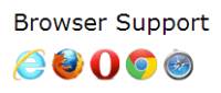
Internet Explorer 9+, Firefox, Chrome, Safari and Opera supports the new semantic elements ...
Note: Internet Explorer 8 and earlier does not support these elements. However, there is a solution ...

... The elements explained above are all block elements (except <figcaption>).
To get these elements to work properly in older browsers, set the display property to block in your style sheet (this causes older browsers to render these elements correctly):
header, section, footer, aside, nav, main, article, figure {
display: block;
}
Problem With Internet Explorer 8 And Earlier
IE8 and earlier does not know how to render CSS on elements that it doesn't recognize. You cannot style new HTML5 elements like <header>, <section>, <footer>, <aside>, <nav>, <article>, <figure>.

Thankfully, Sjoerd Visscher has discovered a JavaScript workaround called HTML5 Shiv; to enable styling of HTML5 elements in versions of Internet Explorer prior to version 9.
You can download and read more about the HTML5 Shiv at:
//code.google.com/p/html5shiv/
To enable the HTML5 Shiv (after downloading), insert the following code into the <head> element:
<!--[if lt IE9]>
<script src="html5shiv.js"></script>
<![endif]-->
The code above is a comment that only versions earlier than IE9 reads. It must be placed in the <head> element because Internet Explorer needs to know about the elements before it renders them.
bhanupratap.com/
III ) Utilizando o HTML5Shiv Para Reconhecer Tags do HTML5
frontendbrasil.com
O script HTML5Shiv foi criado por Remy Sharp para fazer com que os navegadores que não reconheçam as novas tags, passem a reconhecer os novos elementos do HTML5. Para utiliza-lo basta baixar o script ou se preferir você pode chamar ele utilizando o codigo abaixo dentro da sua tag <head>:
<!--[if lt IE 9]>
<script src="//html5shim.googlecode.com/svn/trunk/html5.js"></script>
<![endif]-->
O codigo é um script condicional, diz que se for um Internet Explorer anterior a versao 9 ele ira carregar o HTML5Shiv que esta hospedado no Google Code.
Edited, Apr/2014
... and before we go forward, we must see one recommendation at:
Accumulated knowledge in this stage,
for the developing of my web pages
The HTML5 IE enabling script
<!DOCTYPE html>
<html lang="pt">
<head>
<meta charset="utf-8">
<title>Home Page - João Luis Couto, 1958 - Espinho / Portugal</title>
<meta name="description" content="Index & Highlights on Books, Cinema, Cartoon, History, Travel & Places, Music, Finance & Markets, Sports, HTML & CSS, Knowledge, Wild Life and more...">
<meta name="author" content="João Couto">
<meta name=viewport content="width=device-width, initial-scale=1">
<!--[if lt IE9]>
<script src="//html5shiv.googlecode.com/svn/trunk/html5.js"></script>
<![endif]-->
</head>
...
</html>
html / New basis ...
CSS - Cascading Style Sheets

Contents / Index
- Introduction to style sheets
- CSS font
-
How to size text in CSS
- How to Reset and Normalize in CSS
- My CSS Reset choise, for the moment: Normalize.css v3.0.2
- GENERAL STYLE - Typography
Introduction to style sheets
... Style sheets solve these problems at the same time they supersede the limited range of presentation mechanisms in HTML. Style sheets make it easy to specify the amount of white space between text lines, the amount lines are indented, the colors used for the text and the backgrounds, the font size and style, and a host of other details...
Cascading
This is the capability provided by some style sheet languages such as CSS to allow style information from several sources to be blended together. These could be, for instance, corporate style guidelines, styles common to a group of documents, and styles specific to a single document. By storing these separately, style sheets can be reused, simplifying authoring and making more effective use of network caching. The cascade defines an ordered sequence of style sheets where rules in later sheets have greater precedence than earlier ones...
See more at
Style Sheets W3.org
More interesting links below
Note: With CSS you can control the style and layout of multiple Web pages all at once.
CSS Font
-
Font Families webdesign.about.com
One of the easiest ways to affect the design of a web page is with the fonts that you use... This article will help you find the font family that works best for your situation...
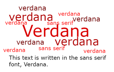
Trivia: Verdana is a font family that was invented for use on the web...
⇒ //webdesign.about.com/od/fonts/a/aa080204.htm
-
Web Safe Fonts webdesign.about.com
If you are trying to create a website with fonts that appear on a large percentage of computers, then you need to use a “web safe font”. While there are only a few fonts that are found on virtually every computer out there, if you use these fonts in your font stacks, your web pages will look correct.
Here are your best bets for sans serif fonts. If you include these in your font stacks, most people will see the page correctly:
- Arial
- Arial Black
- Tahoma
- Trebuchet MS
- Verdana
⇒
//webdesign.about.com/od/fonts/qt/web-safe-fonts.htm
-
Font families + Font styles w3.org
After the color, the font is probably the most basic property of a page. On this page I won't show any "tricks," but I will show the range of font variations that CSS allows...
Most fonts have various styles within the same family, typically a bold and an italic one, often also a bold italic style, somewhat less often a small-caps and in a few cases extra-light/extra-bold or stretched/condensed versions.
The table below shows a number of different styles. Unless you have a very rich collection of fonts, many of the rows will be the same...
⇒
//www.w3.org/Style/Examples/007/fonts.html
-
CSS Fonts Module Level 3 from w3.org
W3C Candidate Recommendation 3 October 2013
This CSS3 module describes how font properties are specified and how font resources are loaded dynamically. The contents of this specification are a consolidation of content previously divided into CSS3 Fonts and CSS3 Web Fonts modules. The description of font load events was moved into the CSS3 Font Load Events module...
At the image, weight and width variations within a single font family
⇒
//www.w3.org/TR/css3-fonts/
-
CSS Font w3schools.com
CSS font properties define the font family, boldness, size, and the style of a text.
The font family of a text is set with the font-family property.
The font-family property should hold several font names as a "fallback" system. If the browser does not support the first font, it tries the next font.
Start with the font you want, and end with a generic family, to let the browser pick a similar font in the generic family, if no other fonts are available.
Note: If the name of a font family is more than one word, it must be in quotation marks, like: "Times New Roman"
⇒
www.w3schools.com/css/css_font.asp
-
CSS Web Safe Font Combinations w3schools.com
Some commonly used font combinations, organized by generic family:
- Georgia, serif
- "Times New Roman", Times, serif
- Arial, Helvetica, sans-serif
- "Arial Black", Gadget, sans-serif
- Tahoma, Geneva, sans-serif
- Verdana, Geneva, sans-serif
- "Courier New", Courier, monospace
⇒ //www.w3schools.com/cssref/css_websafe_fonts.asp
To note that, in Firefox browser and some mobile devices, particularly with Android OS, we can´t see the real "Arial Black"... But yes, we can see it in another browser or, to help you in Firefox and Android, here in
a picture of Arial Black...
-
Verdana wikipedia.org
Verdana is a humanist sans-serif typeface designed by Matthew Carter for Microsoft Corporation, with hand-hinting done by Thomas Rickner, then at Monotype. Demand for such a typeface was recognized by Virginia Howlett of Microsoft's typography group. The name "Verdana" is based on verdant (something green), and Ana (the name of Howlett's eldest daughter)...
⇒
//en.wikipedia.org/wiki/Verdana
How to size text in CSS

After realizing the importance of CSS we should take a look at this subject... Below, in historical order, some highlights and links to follow:
More important links to explore:
-
CSS Values and Units Module Level 3 w3.org
W3C Candidate Recommendation 30 July 2013... This CSS3 module describes the common values and units that CSS properties accept and the syntax used for describing them in CSS property definitions...
-
Understanding pixels and other CSS units docs.webplatform.org
This guide looks into the relationship between CSS pixels and other units, as well as between CSS and device pixels...
rem
1 rem is the computed value of the font-size property for the document’s root element.
This unit is often easier to use than the ‘em’ unit because it is not affected by inheritance as ‘em’ units are.
For example, given a root element font-size of 20px, setting a 0.5em font-size on <li> elements would resolve to 10px for first-level <li> but second-level <li> would have a 5px font-size. Setting the font-size to 0.5rem would result in 10px <li> elements no matter their nesting level.
//docs.webplatform.org/wiki/tutorials/understanding-css-units
Conversions based on 16px browser default size...
pxtoem.com
- Enter a base pixel size and
- Convert PX to EM
pxtoem.com
How to Reset and Normalize in CSS

Looking for the best model to reset and normalize my CSS, I found several models and I will choose one of these below... Better than make copy/paste is really a good download but before that let's read here some stuff...
What Is A CSS Reset?
A CSS Reset (or “Reset CSS”) is a short, often compressed (minified) set of CSS rules that resets the styling of all HTML elements to a consistent baseline.
In case you didn’t know, every browser has its own default ‘user agent’ stylesheet, that it uses to make unstyled websites appear more legible. For example, most browsers by default make links blue and visited links purple, give tables a certain amount of border and padding, apply variable font-sizes to H1, H2, H3 etc. and a certain amount of padding to almost everything. Ever wondered why Submit buttons look different in every browser?
Obviously this creates a certain amount of headaches for CSS authors, who can’t work out how to make their websites look the same in every browser. (NB: article coming soon about why this is a false notion!)
Using a CSS Reset, CSS authors can force every browser to have all its styles reset to null, thus avoiding cross-browser differences as much as possible... More at
What Is A CSS Reset?
Universal Selector ‘*’ Reset
This diminutive CSS Reset employs the universal selector (*) to reset the padding and margins on all elements to zero. It is often expanded to include border: 0; outline: 0 to also reset these values to zero, nada, zilch. The implications of this can be huge, and so this method should never be used unless you know exactly what to expect… More at
cssreset.com/ Universal Selector ‘*’ Reset
Which CSS Reset Should I Use?
The Easy Answer: If you want to know which CSS Reset to use, there are a couple of pointers you can look at straight away. Each of these links leads to some useful discussion and documentation...
For more read at
cssreset.com
Most popular CSS Reset scripts
2014’s most popular CSS Reset scripts, all in one place
- Eric Meyer’s “Reset CSS” 2.0
- HTML5 Doctor CSS Reset Get The Code (23,659)
- Yahoo! (YUI 3) Reset CSS
- Universal Selector ‘*’ Reset
- Normalize.css 1.0
For more details go at
2014’s most popular CSS Reset scripts cssreset.com
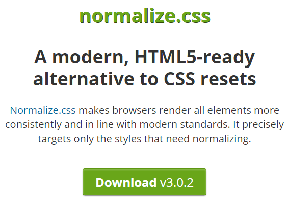
My CSS Reset choise, for the moment:
Normalize.css
Normalize.css is a small CSS file that provides better cross-browser consistency in the default styling of HTML elements. It’s a modern, HTML5-ready, alternative to the traditional CSS reset.
The aims of normalize.css are as follows:
- Preserve useful browser defaults rather than erasing them.
- Normalize styles for a wide range of HTML elements.
- Correct bugs and common browser inconsistencies.
- Improve usability with subtle improvements.
- Explain the code using comments and detailed documentation.
It supports a wide range of browsers (including mobile browsers) and includes CSS that normalizes HTML5 elements, typography, lists, embedded content, forms, and tables.
Despite the project being based on the principle of normalization, it uses pragmatic defaults where they are preferable...
//nicolasgallagher.com/about-normalize-css/
... The project relies on researching the differences between default browser styles in order to precisely target only the styles that need or benefit from normalizing...
View the test file
Before install note, no other styles should come before Normalize.css.
It is recommended that you include the normalize.css file as untouched library code. (*)
What does it do? Browser support, Extended details at
//github.com/necolas/normalize.css
Normalize.css makes browsers render all elements more consistently and in line with modern standards. It precisely targets only the styles that need normalizing.
…as used by Twitter, TweetDeck, GitHub, Soundcloud, Rdio, Guardian, Medium, GOV.UK, Bootstrap, HTML5 Boilerplate, YUI 3, Pure, and many others...
//necolas.github.io/normalize.css/
Accumulated knowledge in this stage,
for the developing of my web pages
normalize.css & rem
html {
font-family: sans-serif; /* 1 */
font-size: 62.5%; /* added for style in rem */
-ms-text-size-adjust: 62.5%; /* 2 (original = 100%) */
-webkit-text-size-adjust: 62.5%; /* 2 (original = 100%) */
}
h1 {
font-size: 32px; font-size: 3.2rem; /* original = 2em */
}
Notes:
(*) Contradicting the author's recommendation, I had to make those changes above and others in the stylesheet
normalize.css to style the text with "rem" according to the directions up here at
FONT SIZING WITH REM and the results look okay while it seems there are small differences between the browsers...
I also had doubts on text-size-adjust ??? Will be font-size-adjust ?
html / New basis ...
HTML Style

Linking to style sheets
To link to style sheets from your documents, add the following in the head of your document:
<LINK REL="stylesheet" TYPE="text/css" HREF="/StyleSheets/xxxxxx">
Then replace the x'es with the name of your style sheet, e.g. "member". The ".css" extension is not necessary...
See more at
W3C Style Sheets w3.org
and more at
HTML Styles - CSS w3schools.com
... and before we go forward, we must see one recommendation at:
Accumulated knowledge in this stage,
for the developing of my web pages
HTML style
<!DOCTYPE html>
<html lang="pt">
<head>
<meta charset="utf-8">
<title>Home Page - João Luis Couto, 1958 - Espinho / Portugal</title>
<meta name="description" content="Index & Highlights on Books, Cinema, Cartoon, History, Travel & Places, Music, Finance & Markets, Sports, HTML & CSS, Knowledge, Wild Life and more...">
<meta name="author" content="João Couto">
<meta name=viewport content="width=device-width, initial-scale=1">
<link rel="stylesheet" href="styles/normalize.css">
<link rel="stylesheet" href="styles/general-style.css">
<!--[if lt IE9]>
<script src="//html5shiv.googlecode.com/svn/trunk/html5.js"></script>
<![endif]-->
</head>
...
</html>
html / New basis ...
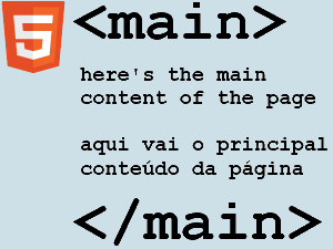
The main element
Recently, <main> was formally added to the W3C HTML specification. Now that the dust has settled, it’s about time we dive in to find out where and when it’s appropriate to use <main>. Let’s get started.
History
... The proposal was accepted in November 2012, and <main> was then rolled into the HTML5.1 specification. Recently, it was added to the HTML5 specification following no objections...
html5doctor.com
Getting Going
Just as with the introduction of many other new HTML5 elements, not all browsers recognise <main> or have preset styles for it. You’ll need to ensure it displays as a block level element in your CSS:
For the time being, you'll also need to use JavaScript to create the element for older versions of IE:
<script>document.createElement('main');</script>
Of course, if you use the html5shiv, <main> is now baked in directly...
html5doctor.com
Notes
There must not be more than one <main> element in a document. The <main> element must NOT be a descendent of an <article>, <aside>, <footer>, <header>, or <nav> element...
w3schools.com
The main element is distinct from the section and article elements in that the main element does not contribute to the document outline...
whatwg.org
My own experience
This should already be at least the 3rd failed attempt to try to get to work my <main> at 100%... but IE is really f**** and neither with display blok nor with html5shiv.js it works... everything ok for the other browsers but without IE I will not move forward... So for now I will keep my div, specifically <div id="maincontent">
However, with some curiosity and amazement, I find the fact that by this stage, also the main drivers of this element does not already have advanced with new semantic elements... Passing a look at source code of the page w3.org/ we find some pearls, such as:
<div id="w3c_main">
<div class="main-content">
<div id="w3c_footer">
<div id="w3c_mast"><!-- #w3c_mast / Page top header -->
As you can see, are divs for everywhere which does not surprise me after seeing also the DOCTYPE... See below for yourself on view-source, line 89
view-source
www.w3.org/
What's the trick?
Yes, there is something that I have not discovered yet because in fact we may find online many sites where we can see the <main> working perfectly with the IE... Anyone can confirm this, simply opening with the IE on their PC, sites like
html5doctor,
sitepoint, etc...
PS.
I do not give up easily, the trick seems I already found and is a simple <main role="main"> but in the meantime I think I'll give up for a while with the <main> because what I read now is nothing encouraging and the truth is that if the thing is working relatively well with a <div> why complicate...
Browser compatibility
As a newly-proposed feature of HTML, the <main> element is not yet supported widely. You are strongly urged to add the "main" ARIA role to any <main> element:
<main role="main">
...
</main>
//developer.mozilla.org/en-US/docs/Web/HTML/Element/main
The imbroglio
This gets complicated because the problem is that, apart from Internet Explorer for desktop we still have to count, amongst others, with Android for mobile that also appears on the red colored Not supported, so it is better for now to be quiet in relation to <main>... see link above from mozilla.org for browser compatibility
Edited, 07 Jun/2014
Can I use_______?
On about <main> tag, see also this:
"Partial support refers to missing the default styling. This is easily taken care of by using display:block for all new elements (except time and mark, these should be display:inline anyway). IE11 and older versions of other browsers do not support the <main> element."
See article and image on "New semantic elements / Notes" in this link
caniuse.com/#search=main
4 The elements of HTML
4.4.13 The main element
"In this example, the author has used a presentation where each component of the page is rendered in a box. To wrap the main content of the page (as opposed to the header, the footer, the navigation bar, and a sidebar), the main element is used."
See example at
html.spec.whatwg.org
Implementing <main> on HTML5 Doctor
The easiest way to implement <main> is to replace that <div> that you've likely got with an id or class of something like main or content...
And here's what it's like now:
<body>
<header role="banner">
[...]
</header>
<main id="content" class="group" role="main">
[...]
</main>
<footer role="contentinfo">
[...]
</footer>
</body>
See article at
//html5doctor.com/the-main-element/
The main (role)
The main content of a document.
This marks the content that is directly related to or expands upon the central topic of the document. The main role is a non-obtrusive alternative for "skip to main content" links, where the navigation option to go to the main content (or other landmarks) is provided by the user agent through a dialog or by assistive technologies.
User agents SHOULD treat elements with the role of main as navigational landmarks.
Within any document or application, the author SHOULD mark no more than one element with the main role.
Permalink for main:
//www.w3.org/TR/wai-aria/roles#main
Note: This section is normative.
More Landmark Roles and all roles at
//www.w3.org/TR/wai-aria/roles#landmark_roles
W3C Recommendation 28 October 2014
on main element says:
Authors are advised to use ARIA role="main" attribute on the main element until user agents implement the required role mapping
Link at //www.w3.org/TR/html/grouping-content.html#the-main-element
Edited, 30 Nov/2014
Accumulated knowledge in this stage,
for the developing of my web pages
HTML ARIA role="main"
<main role="main">
[...]
</main>
CSS / main
Note: for older versions of IE you'll also need to use html5shiv JavaScript in the <head> container to create the <main> element.
html / New basis ...
Sections - Article or section?
A Preview of HTML 5
...
The use of div elements is largely because current versions of HTML 4 lack the necessary semantics for describing these parts more specifically. HTML 5 addresses this issue by introducing new elements for representing each of these different sections.
alistapart.com
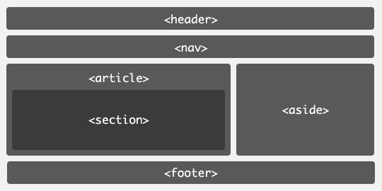

W3C Recommendation 28 October 2014
Sections
//www.w3.org/TR/html5/sections.html
Usage summary
//www.w3.org/TR/html5/sections.html#usage-summary-0
The article element
The article element represents a complete, or self-contained, composition in a document, page, application, or site and that is, in principle, independently distributable or reusable, e.g. in syndication. This could be a forum post, a magazine or newspaper article, a blog entry, a user-submitted comment, an interactive widget or gadget, or any other independent item of content.
When article elements are nested, the inner article elements represent articles that are in principle related to the contents of the outer article. For instance, a blog entry on a site that accepts user-submitted comments could represent the comments as article elements nested within the article element for the blog entry.
Author information associated with an article element (q.v. the address element) does not apply to nested article elements.
When the main content of the page (i.e. excluding footers, headers, navigation blocks, and sidebars) is all one single self-contained composition, the content should be marked up with a main element and the content may also be marked with an article, but it is technically redundant in this case (since it's self-evident that the page is a single composition, as it is a single document).
The section element
The section element represents a generic section of a document or application. A section, in this context, is a thematic grouping of content. The theme of each section should be identified, typically by including a heading (h1-h6 element) as a child of the section element.
Examples of sections would be chapters, the various tabbed pages in a tabbed dialog box, or the numbered sections of a thesis. A Web site's home page could be split into sections for an introduction, news items, and contact information.
Note: Authors are encouraged to use the article element instead of the section element when it would make sense to syndicate the contents of the element.
Note: The section element is not a generic container element. When an element is needed only for styling purposes or as a convenience for scripting, authors are encouraged to use the div element instead. A general rule is that the section element is appropriate only if the element's contents would be listed explicitly in the document's outline.
Article or section?
This section is non-normative.
A section forms part of something else. An article is its own thing. But how does one know which is which? Mostly the real answer is "it depends on author intent".
For example, one could imagine a book with a "Granny Smith" chapter that just said "These juicy, green apples make a great filling for apple pies."; that would be a section because there'd be lots of other chapters on (maybe) other kinds of apples.
On the other hand, one could imagine a tweet or reddit comment or tumblr post or newspaper classified ad that just said "Granny Smith. These juicy, green apples make a great filling for apple pies."; it would then be articles because that was the whole thing.
A comment on an article is not part of the article on which it is commenting, therefore it is its own article.
w3.org/TR/html5/sections
Important:
To realize some more things and for historical reasons we should also read this:
Some issues like:
- Goodbye <div> soup, hello semantic markup
- Goodbye class attributes, hello clean markup
- Targeting HTML-5 elements without classes or ids
- Advanced targeting of HTML 5 with CSS 3
For more go at
perishablepress.com
html / New basis ...
Media Queries

Introduction to CSS Media Queries
Screens can range from the large displays on their work stations, to their laptops on the air plane, to their iPad or other tablets while sitting in the park and finally on their small mobile phone screens on the go.
CSS3 introduced media queries and made life for web developers exciting once again. Now we are able to target specific screen sizes.
...
Comments
Someone said:
- Worked great on the desktop screen, resizing it -- but isn't on the phone -- weird.
Right answer:
- You'll need this:
<meta name="viewport" content="initial-scale=1.0,width=device-width" />
Otherwise you're site can't tell if it's a normal browser or device ;)
Full article at ...
htmlgoodies.com
Media Queries Level 4
Editor’s Draft, 30 October 2014
A media query is a method of testing certain aspects of the user agent or device that the document is being displayed in. Media queries are (almost) always independent of the contents of the document, its styling, or any other internal aspect; they’re only dependent on “external” information unless another feature explicitly specifies that it affects the resolution of Media Queries, such as the @viewport rule...
w3.org / 2. Media Queries
Responsive Web Design – Best Practices
The idea behind responsive design is basically to provide one design for all possible output devices, meaning desktops, smartphones, tablets (screen sizes and resolutions). An important point to be considered is also the accessibility by all kinds of input mechanisms like mouse, keyboard, touch, etc.

A lot has been written about responsive web design in the past months. There are a lot of good articles out there on the internet and books on all kinds of interesting topics regarding this topic. The following post is a collection of what I think are the “Best Practices” in late 2012.
cargomedia.ch
Other articles on this subject
To see again:


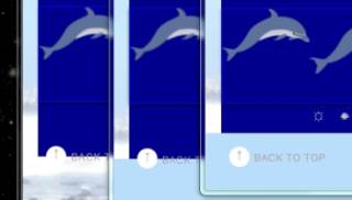


 ...
...


social networks